Code
library(tidyverse)
library(tidymodels)
library(scales)
library(themis)
library(knitr)
library(glue)
library(reactable)
library(reactablefmtr)Based on the website:
Extraction was done by Barry Becker from the 1994 Census database. A set of reasonably clean records was extracted using the following conditions: ((AAGE>16) && (AGI>100) && (AFNLWGT>1)&& (HRSWK>0))
library(tidyverse)
library(tidymodels)
library(scales)
library(themis)
library(knitr)
library(glue)
library(reactable)
library(reactablefmtr)For this target income prediction, we will be utilizing a data-set from the UCI Machine Learning Repository called adult dataset. The link to the data-set is: https://archive.ics.uci.edu/dataset/2/adult
income_dataset <- read_csv("input/adult.csv")To achieve our objectives of this project, the target feature is identified. It is based on the nature of the response variable (whether an individual is earning: <=50k or >50k annually)
In this dataset, you will find 48,842 rows and 15 columns:
| Target Feature | Type | Description |
|---|---|---|
| income | Character | <=50k or >50k |
| Feature | Type | Description |
|---|---|---|
| age | Integer | Individual’s age |
| workclass | Character | Individual’s sector of employment |
| fnlwgt | Integer | Final weight |
| education | Character | Highest education degree |
| educational-num | Integer | Highest education degree (Numeric form) |
| marital-status | Character | Individual’s marital status |
| occupation | Character | Individual’s occupation |
| relationship | Character | Relationship role in a family |
| race | Character | Individual’s race |
| gender | Character | Individual’s gender |
| capital-gain | Integer | Capital gain in the previous year |
| capital-loss | Integer | Capital loss in the previous year |
| hours-per-week | Integer | Working hour (per week) |
| native-country | Character | Individual’s native country |
Let’s do some quick exploration, by examining the income distribution, grouped as either <=50k or >50k.
The plot shows the distribution of income, $50k or below or above $50k.
income_dataset %>%
  count(income) %>%
  mutate(percentage = round((n / sum(n)) * 100, 2)) %>%
  ggplot(aes(x = fct_reorder(income, n), y = n)) +
  geom_col(width = 0.5) +
  coord_flip() +
  scale_y_continuous(labels = comma, expand = c(0,0), limits=c(0,50000)) +
  geom_text(mapping=aes(label= glue("{comma(n)} ({percentage}%)"),
                        x = income),
            size= 3.5, hjust = -0.5, family = "Karla") +
  labs(x = "Class",
       y = "Total",
       title = "Distribution of Income")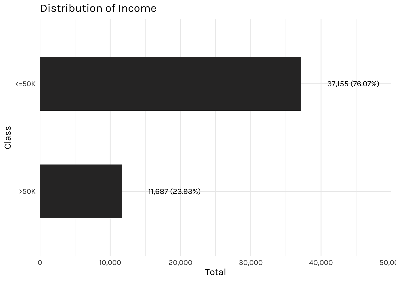
This dataset is slightly imbalanced, with the majority of individuals earning <=50k annually and the minority of individuals earning >50k.
income_dataset %>%
  ggplot(aes(x = age)) +
  geom_histogram(bins = 20) +
  scale_y_continuous(expand = c(0,0)) +
  scale_x_continuous(breaks = c(seq(from = 17, to = 95, by = 10))) +
  labs(x = "Age",
       y = "",
       title = "Distribution of Age")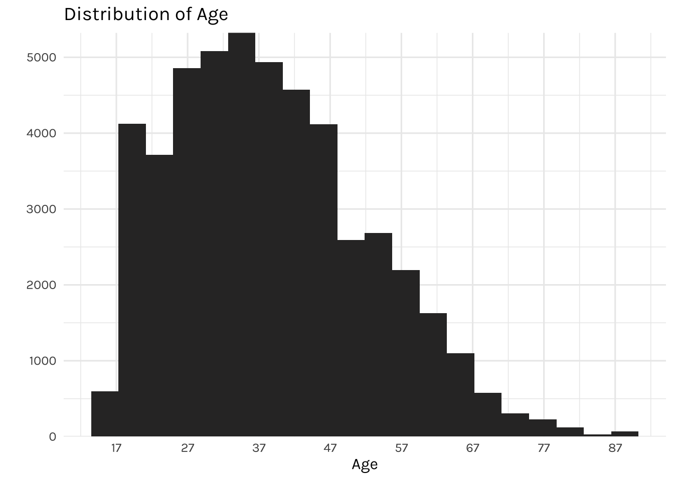
The graph above is showing the distribution of individuals by age. It displays a right-skewed distribution, where most of the individuals are falling between the ages of 27 and 47, while the youngest individual in the dataset is 17 and the oldest is 90 years of age.
## Level

desired_level_work_class <- income_dataset %>%
  count(workclass, income) %>%
  group_by(workclass) %>%
  mutate(percentage = round((n / sum(n)) * 100, 2)) %>%
  filter(income == "<=50K") %>%
  arrange(percentage) %>%
  pull(workclass) %>%
  unique()


income_dataset %>%
  count(workclass, income) %>%
  mutate(workclass = factor(workclass, levels = desired_level_work_class),
         income = factor(income, levels = c(">50K", "<=50K"))) %>%
  ggplot(aes(x = workclass, y = n, fill = income)) +
  geom_bar(width = 0.5, position="fill", stat="identity") +
  coord_flip() +
  scale_y_continuous(labels = percent) +
  labs(title = "Percentage of income by working class",
       x = "",
       y = "",
       fill = "Income")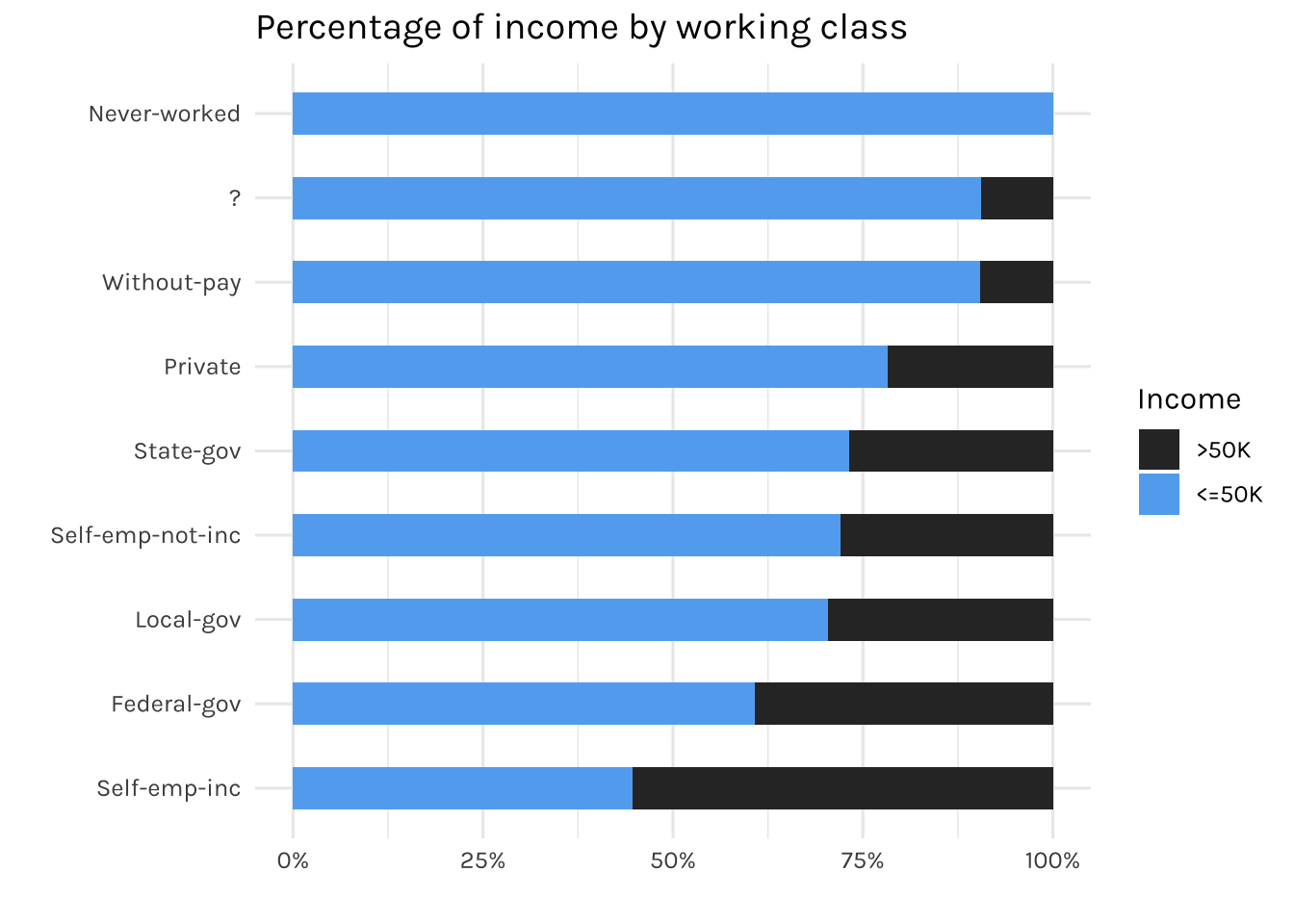
The graph displays the percentage of working-class individuals who earn <=50k or >50k annually. As expected, individuals who never worked before earned less than 50k annually. Besides, as it can be seen, there is a “?” in the working class category in which we will address later on.
income_dataset %>%
  count(education, income) %>%
  mutate(income = factor(income, levels = c(">50K", "<=50K"))) %>%
  ggplot(aes(x = fct_reorder(education, n), y = n, fill = income)) +
  geom_col(width = 0.5) +
  coord_flip() +
  scale_y_continuous(labels = comma, limits = c(0, 18000)) +
  labs(title = "Distribution of highest education degree",
       x = "",
       y = "",
       fill = "Income")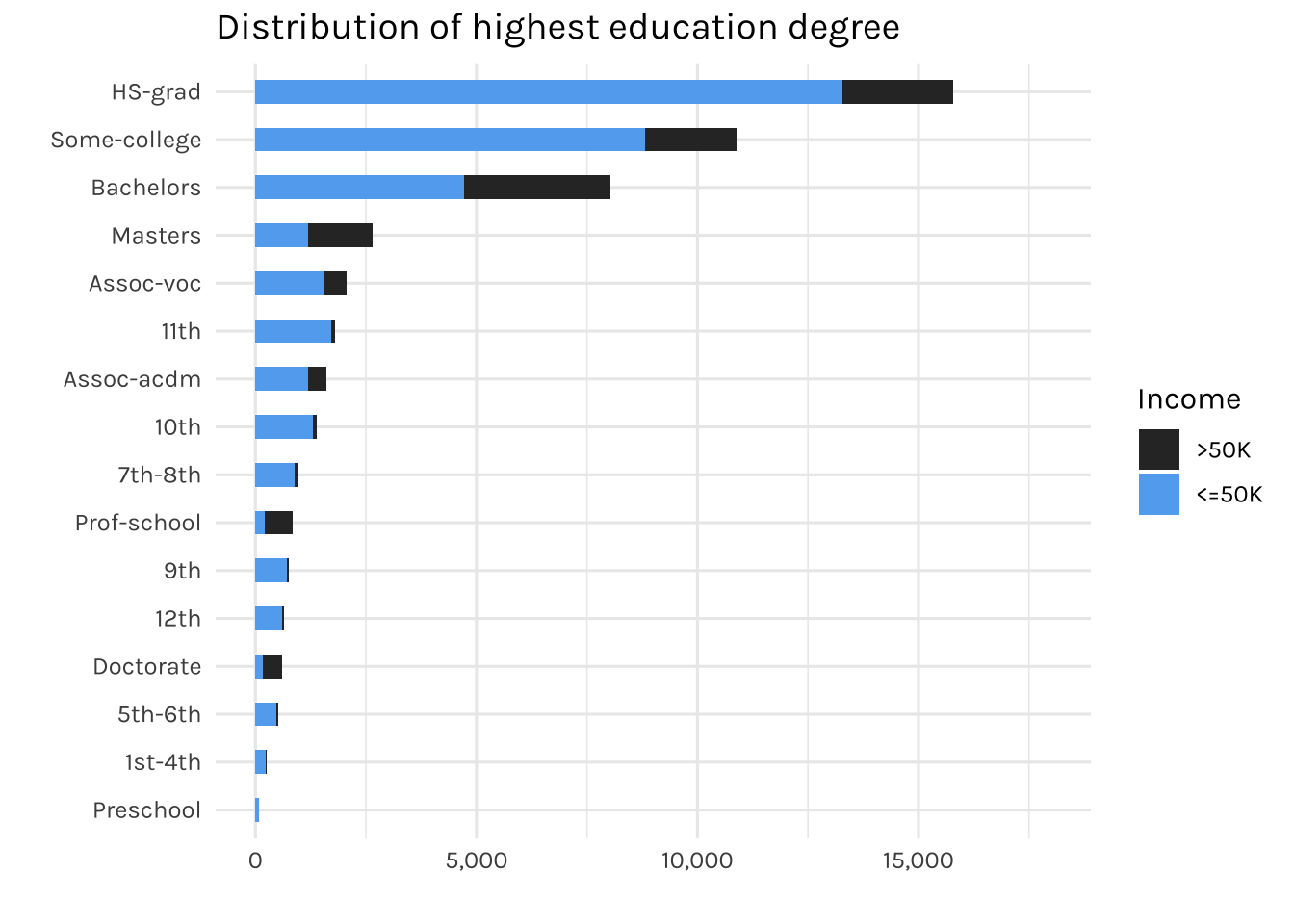
It can be observed that most of the individuals here have a high school degree (HS-grad). Interestingly, there are 83 individuals with only a pre-school education. Let’s see the distribution of income (<=50k or >50k) for individuals who have pre-school as their highest education degree.
income_dataset %>%
  filter(education == "Preschool") %>%
  count(income) %>%
kable()| income | n |
|---|---|
| <=50K | 82 |
| >50K | 1 |
income_dataset %>%
  count(`marital-status`, income) %>%
  mutate(income = factor(income, levels = c(">50K", "<=50K"))) %>%
  ggplot(aes(x = fct_reorder(`marital-status`, n), y = n, fill = income)) +
  geom_col(width = 0.5) +
  coord_flip() +
  scale_y_continuous(labels = comma, limits = c(0, 25000)) +
  labs(title = "Distribution of marital status",
       x = "",
       y = "",
       fill = "Income")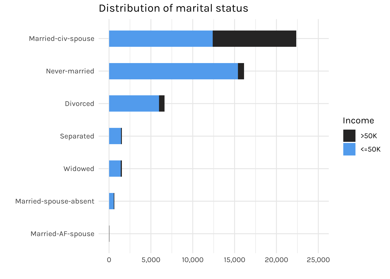
The graph above is showing the distribution of individuals by marital status
income_dataset %>%
  count(occupation, income) %>%
  mutate(income = factor(income, levels = c(">50K", "<=50K"))) %>%
  ggplot(aes(x = fct_reorder(occupation, n), y = n, fill = income)) +
  geom_col(width = 0.5) +
  coord_flip() +
  scale_y_continuous(labels = comma, limits = c(0, 7500)) +
  labs(title = "Distribution of occupation",
       x = "",
       y = "",
       fill = "Income")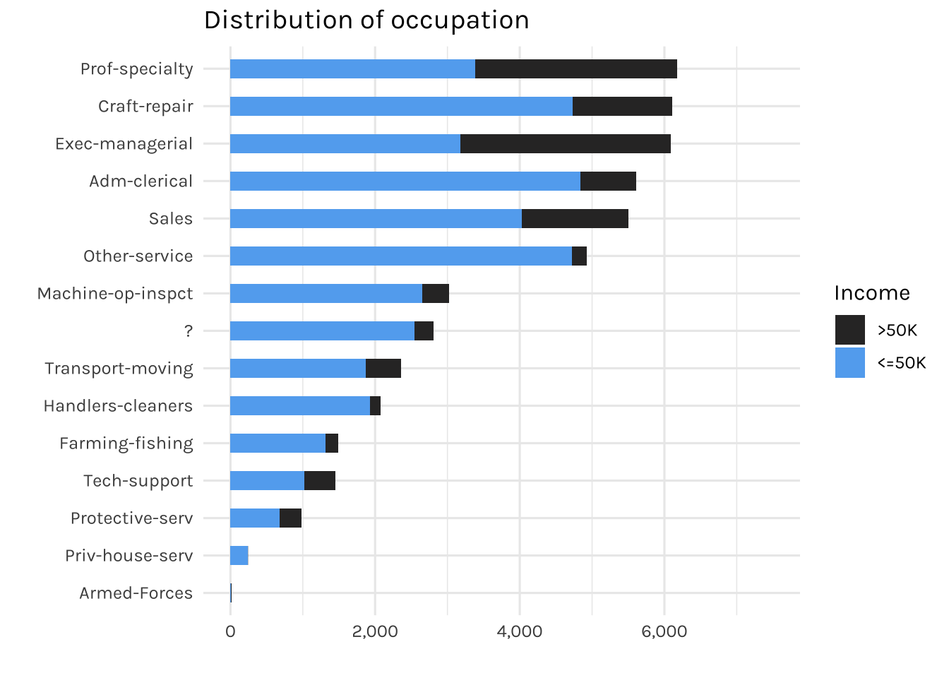
Most individuals are working in expert roles, meanwhile, the fewest (15) are working in the armed forces. Additionally, there is also a “?” present in the occupation feature, which we will deal with later on.
income_dataset %>%
  count(relationship, income) %>%
  mutate(income = factor(income, levels = c(">50K", "<=50K"))) %>%
  ggplot(aes(x = fct_reorder(relationship, n), y = n, fill = income)) +
  geom_col(width = 0.5) +
  coord_flip() +
  scale_y_continuous(labels = comma, limits = c(0, 22000)) +
  labs(title = "Distribution of relationship",
       x = "",
       y = "",
       fill = "Income")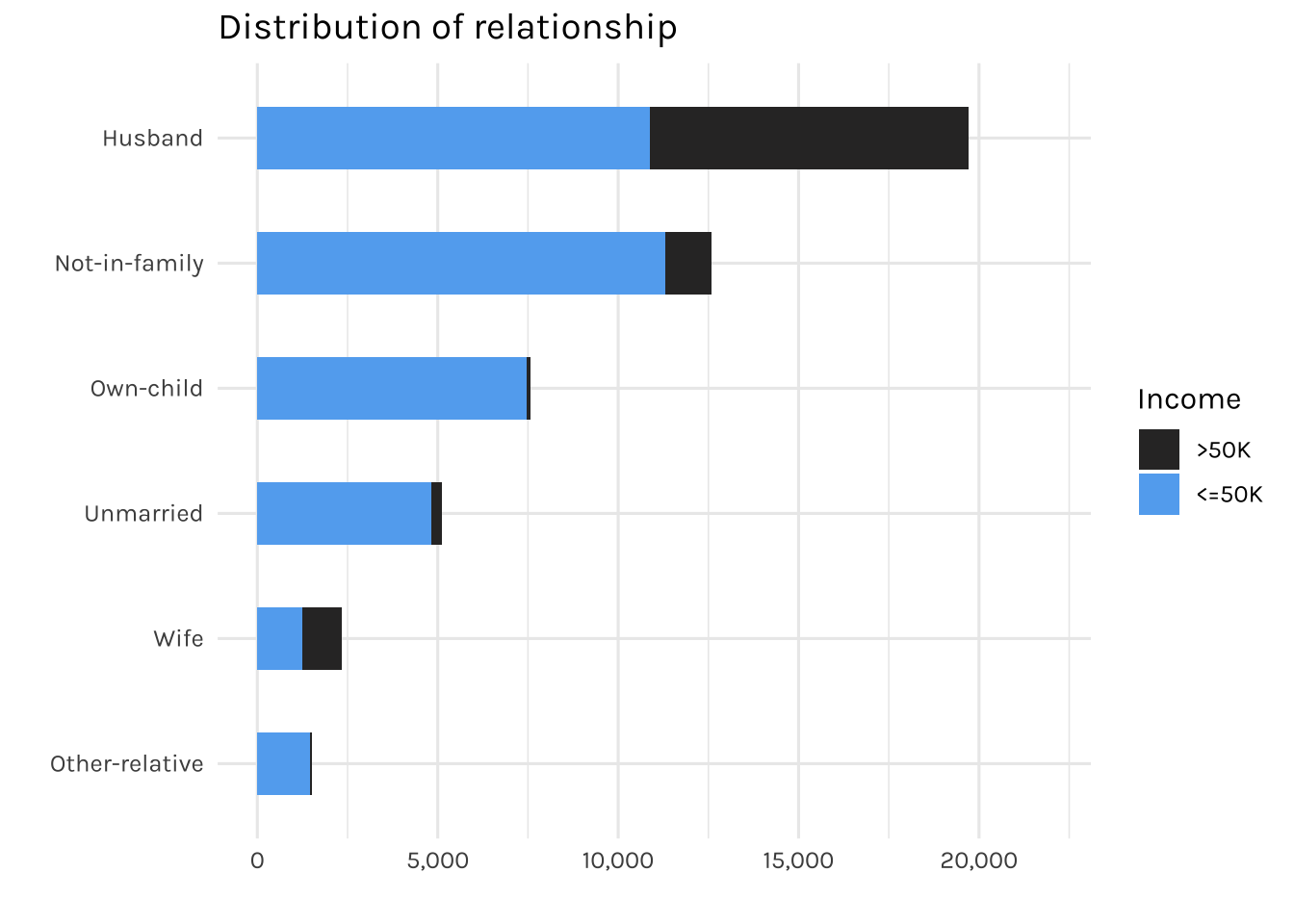
The graph is displaying the relationships recorded in this dataset.
## Level

desired_level_race <- income_dataset %>%
  count(race, income) %>%
  group_by(race) %>%
  mutate(percentage = round((n / sum(n)) * 100, 2)) %>%
  filter(income == "<=50K") %>%
  arrange(percentage) %>%
  pull(race) %>%
  unique()

income_dataset %>%
  count(race, income) %>%
  mutate(race = factor(race, levels = desired_level_race),
         income = factor(income, levels = c(">50K", "<=50K"))) %>%
  ggplot(aes(x = race, y = n, fill = income)) +
  geom_bar(width = 0.5, position="fill", stat="identity") +
  coord_flip() +
  scale_y_continuous(labels = percent) +
  labs(title = "Percentage of income by race",
       x = "Workclass",
       y = "",
       fill = "Income")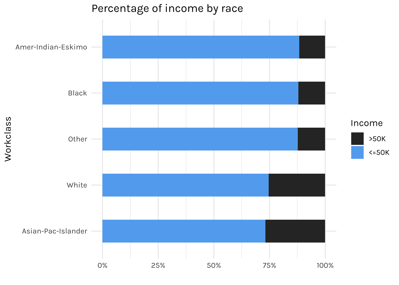
Now the graph above displays the percentage of income (<=50k or >50k) for each race.
income_dataset %>%
  count(gender, income) %>%
  mutate(income = factor(income, levels = c(">50K", "<=50K"))) %>%
  ggplot(aes(x = fct_reorder(gender, n), y = n, fill = income)) +
  geom_col(width = 0.5) +
  coord_flip() +
  scale_y_continuous(labels = comma, limits = c(0, 35000)) +
  labs(title = "Distribution of gender",
       x = "",
       y = "",
       fill = "Income")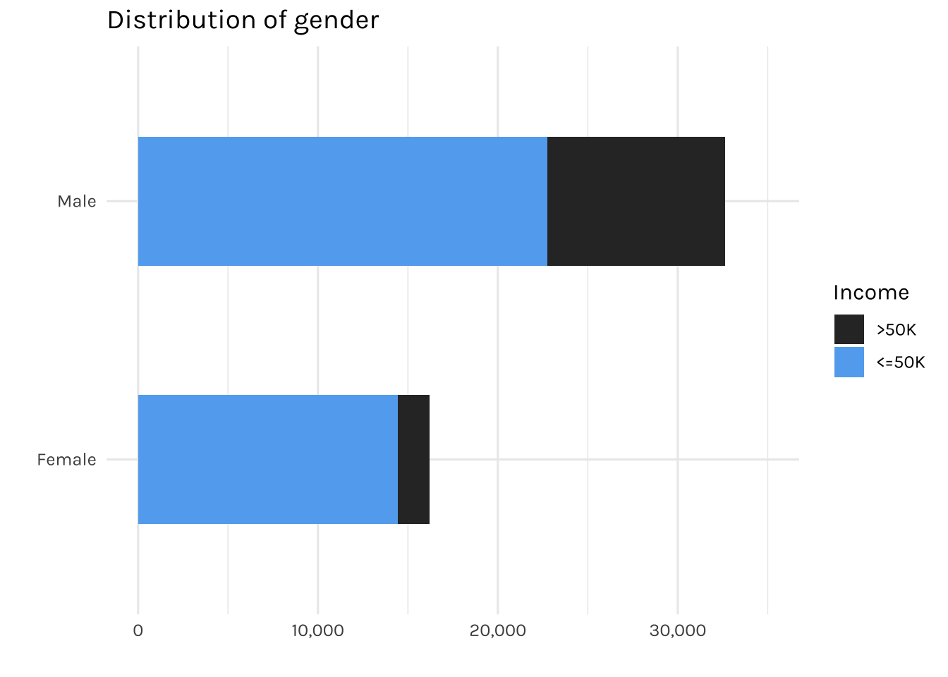
The graph above is showing the total number of individuals by gender. It can be seen that the majority of females are earning less than 50k annually.
income_dataset %>%
  mutate(`hours-per-week` = case_when(`hours-per-week` < 40 ~ "<40",
                                      `hours-per-week` >= 40 ~ ">=40")) %>%
  count(`hours-per-week`, income) %>%
  mutate(income = factor(income, levels = c(">50K", "<=50K"))) %>%
  ggplot(aes(x = fct_reorder(`hours-per-week`, n), y = n, fill = income)) +
  geom_col(width = 0.5) +
  coord_flip() +
  scale_y_continuous(labels = comma, limits = c(0, 40000)) +
  labs(title = "Distribution of working hours per week",
       x = "",
       y = "",
       fill = "Income")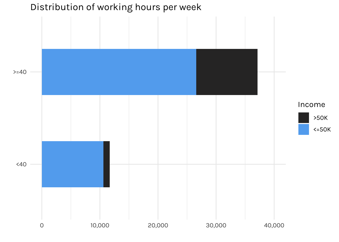
A study by Stanford University indicates that the ideal number of hours for a productive workweek is 35-40 hours. Therefore, for the sake of simplifying the way we analyse the data, we will group working hours as either <40 or >= 40, rather than using the original continuous format.
income_dataset %>%
  mutate(`native-country` = fct_lump(`native-country`, prop = 0.05)) %>%
  count(`native-country`, income) %>%
  mutate(income = factor(income, levels = c(">50K", "<=50K"))) %>%
  ggplot(aes(x = fct_reorder(`native-country`, n), y = n, fill = income)) +
  geom_col(width = 0.5) +
  coord_flip() +
  scale_y_continuous(labels = comma, limits = c(0, 50000)) +
  labs(title = "Distribution of countries",
       x = "",
       y = "",
       fill = "Income")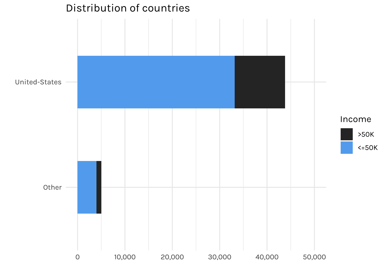
Most of the individuals in this dataset are from the US, with less than 5% are from other countries. Therefore, for countries with less than 5% representation will be grouped into an “Other” category.
As mentioned earlier, we identified “?” in multiple features of our data set. Hence in this project, we will be treating “?” as missing values to indicate that these values are not available.
# Calculate percentage of missing values in each column
missing <- income_dataset %>%
  # Change ? to na
  mutate(across(everything(), ~if_else(. == "?", NA, .))) %>%
  summarise(across(everything(), ~sum(is.na(.))/n())) %>%
  gather(key = "variable", value = "pct_missing")


# Plot the percentage of missing values
missing %>%
  arrange(desc(pct_missing)) %>%
  ggplot(aes(x = fct_reorder(variable, pct_missing), y = pct_missing)) +
  geom_col() +
  coord_flip() +
  geom_text(mapping=aes(label= percent(pct_missing, accuracy = 0.01), x = variable),
            size= 3, hjust = -0.5) +
  labs(x = "Variable", y = "Percentage of Missing Values",
       title = "Percentage of Missing Values by Column") +
  scale_y_continuous(labels = percent, expand = c(0,0), limits=c(0,1))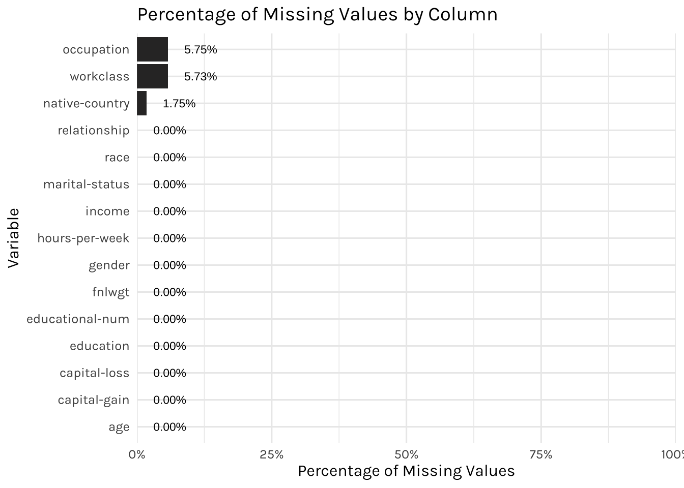
Since the missing values constitute only about 5% in the occupation, workclass & native-country columns, we will remove them from our modelling later on.
For this project, tidymodels package will be used to split the dataset into training & testing sets, with an 80:20 split ratio
set.seed(1234)

income_split <- income_dataset |>
  initial_split(prop = 0.8, strata = income)

income_train <- training(income_split)
income_test <- testing(income_split)
Cross validation: A technique often used to estimate the generalization error of the models, which would be the error that the models make on new, unseen data.
In our project, we will be applying k-fold cross validation; where the data will be split into k folds, and the model is trained and tested k times. To save time and resources, we are using a 5-fold cross-validation.
income_folds <- vfold_cv(income_train, v = 5, strata = income)We will be applying three concepts:
Baseline (no sampling technique applied),
Downsampling
Upsampling
No class imbalance technique is applied to handle class imbalance (income)
income_baseline_rec <- income_train %>%
  recipe(income ~ .) %>%
  step_filter(workclass != "?", occupation != "?", `native-country` != "?") %>%
  step_rm(`educational-num`) %>%
  step_mutate(`hours-per-week` = case_when(`hours-per-week` < 40 ~ "<40",
                                      `hours-per-week` >= 40 ~ ">=40")) %>%
  step_string2factor(`hours-per-week`) %>%
  step_other(`native-country`, threshold = 0.05, other = "Other") %>%
  step_dummy(all_nominal(), -all_outcomes()) %>%
  step_zv(all_numeric_predictors()) %>%
  step_normalize(all_numeric_predictors())

income_baseline_recWe will be applying downsampling technique. It is a technique used to handle class imbalance in a dataset. In the context of this Adult income dataset, downsampling could be applied to reduce the number of <=50K to a level that is more balanced with the number of >50K.
income_downsample_rec <- income_baseline_rec %>%
  step_downsample(income)

income_downsample_recWe will be applying upsampling technique. This is a technique used to duplicate existing instances in the >50K class, bringing the number of >50K to a level that is more balanced with the number of <=50K.
income_upsample_rec <- income_baseline_rec %>%
  step_upsample(income)

income_upsample_recPredictive modeling is developed using Logistic Regression:
## Logistic
glm_set <- logistic_reg() %>%
  set_engine("glm")

glm_set
Logistic Regression Model Specification (classification)
Computational engine: glm We will also develop Linear Support Vector Machine:
svm_set <-
  svm_linear() %>%
  set_mode("classification") %>%
  set_engine("LiblineaR")

svm_set
Linear Support Vector Machine Model Specification (classification)
Computational engine: LiblineaR We will now be employing a tidymodels workflow to fit logistic regression & SVM models which allows to easily compare between the two models and also preprocess the data using the recipes defined earlier.
## Set workflow

income_models <-
  workflow_set(
    preproc = list(
      baseline = income_baseline_rec,
      downsample = income_downsample_rec,
      upsample = income_upsample_rec
    ),
    models = list(glm = glm_set,
                  svm = svm_set),
    cross = TRUE
  )


set.seed(1234)
doParallel::registerDoParallel()

## Fit models

income_rs <-
  income_models %>%
  workflow_map(
    resamples = income_folds,
    metrics = metric_set(accuracy, sensitivity, specificity, precision)
)Comparing the performance of Logistic Regression and Linear SVM in the table below:
In our baseline models, we are performing very well in terms of the sensitivity values but not specificity. This is due to the slight imbalance in our income (target variable), hence it affects the models’ ability to classify the minorities very well
This is where undersampling & oversampling help to handle the class imbalance. While they may reduce the sensitivity values slightly, but they significantly improve the specificity values, which also are very important for our analysis. Although both models performed fairly well, we will be going for SVM (downsample) as it has slightly higher specificity and precision.
collect_metrics(income_rs) %>%
  ## select only necessary columns
  select(wflow_id,model, .metric, mean) %>%
  ## round off
  mutate(mean = round(mean,4)) %>%
  mutate(wflow_id = case_when(str_detect(wflow_id, "baseline") ~ "Baseline",
                              str_detect(wflow_id, "downsample") ~ "Downsample",
                              str_detect(wflow_id, "upsample") ~ "Upsample")) %>%
  pivot_wider(names_from = model,
              values_from = mean) %>%
  rename(`Logistic Regression` = logistic_reg,
         `SVM Linear` = svm_linear) %>%
  reactable(filterable = T,
            columns = list(
              `Logistic Regression` = colDef(
                cell = data_bars(.,
                       fill_opacity = 0.8,
                       text_position = "above",
                       number_fmt = scales::percent_format(accuracy = 0.01))),

               `SVM Linear` = colDef(
                cell = data_bars(.,
                       fill_opacity = 0.8,
                       text_position = "above",
                       number_fmt = scales::percent_format(accuracy = 0.01)))
))Having obtained satisfying performance on the training set, we would then apply the SVM (undersample) model to the test data.
## getting the best model
best_workflow <- collect_metrics(income_rs) %>%
                      filter(.metric == "specificity") %>%
                      slice_max(mean) %>%
                      pull(wflow_id)


final_wf <- extract_workflow(income_rs, best_workflow)


final_fit <- last_fit(
    final_wf,
    income_split,
    metrics = metric_set(accuracy, sensitivity, specificity, precision)
  )

collect_metrics(final_fit) %>%
  select(.metric, .estimate) %>%
  rename(Metric = .metric,
         Value = .estimate) %>%
  reactable(filterable = T,
            columns = list(
              Value= colDef(
                cell = data_bars(.,
                       fill_opacity = 0.8,
                       text_position = "above",
                       number_fmt = scales::percent_format(accuracy = 0.01)))
  ))
Meanwhile, this is the confusion matrix:
collect_predictions(final_fit) %>%
  conf_mat(income, .pred_class) %>%
  pluck(1) %>%
  as_tibble() %>%
  ggplot(aes(Prediction, Truth, fill = n)) +
  geom_tile(show.legend = FALSE, alpha = 0.2) +
  scale_fill_gradient2(low = "#CCCCCC",
                       mid = "#FFFFCC",
                       high = "#aaaaaa") +
  geom_text(aes(label = n), alpha = 1, size = 4) +
  theme(panel.grid = element_blank())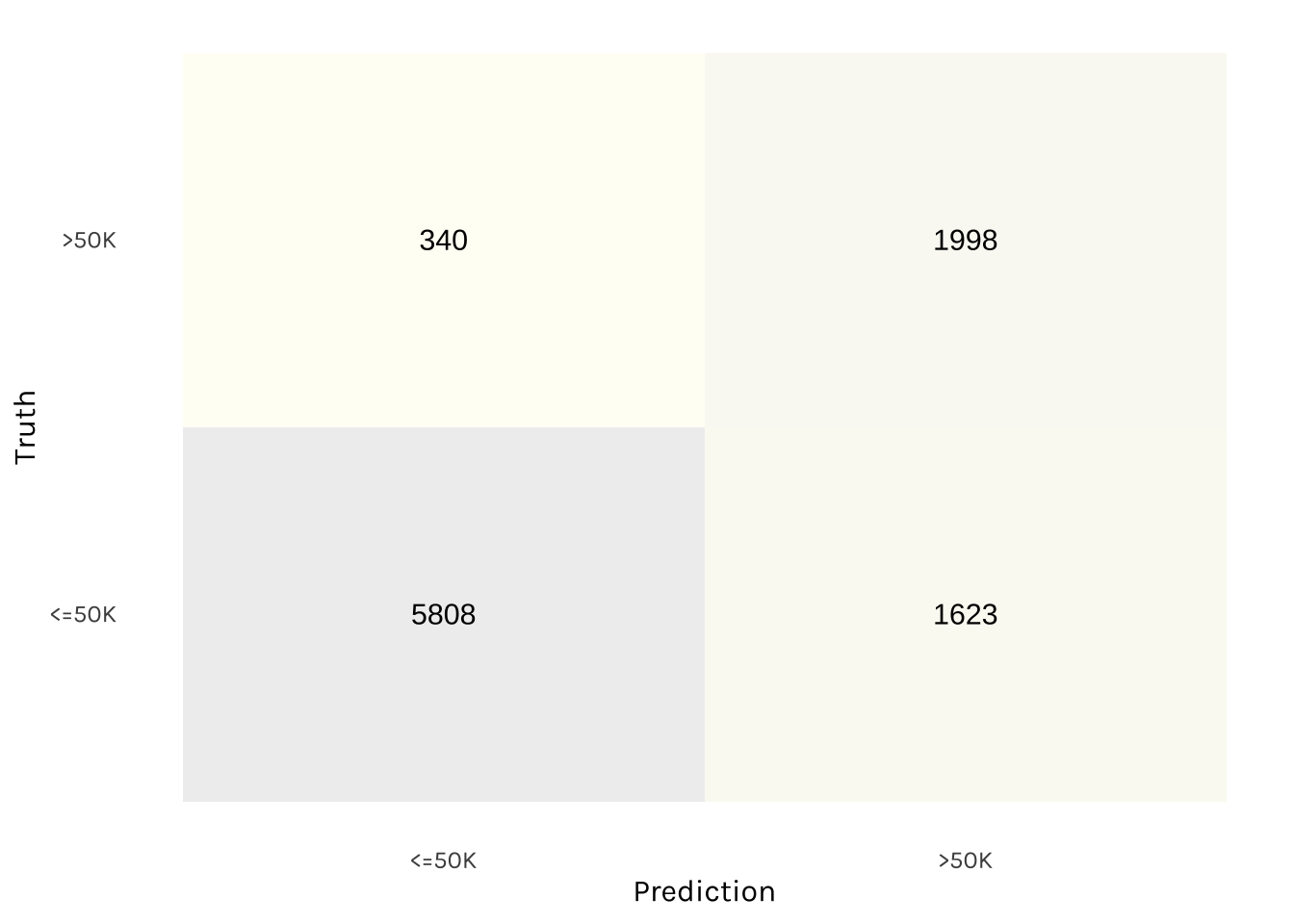
Based on the test data, the SVM (undersample) model performed fairly well. These results demonstrate that the model’s ability to classify a high percentage of both “<=50K” and “>50K” on the test data, making it a reliable and accurate choice for our application.